Matplotlib is one of the most popular Python libraries used for data visualization and plotting 2D arrays. It provides a wide range of plotting functionality to create interactive visualizations and production-quality figures in Python. Matplotlib can generate histograms, scatter plots, bar charts, pie charts, error charts, area charts and many more with just a few lines of code.
This comprehensive guide will provide an introduction to Matplotlib by examining key features, installation, basic plots, customizing visuals, saving, showing and embedding plots. We will also explore some of the most common plot types and useful tips for effective data visualization. Real-world examples and sample codes are provided throughout to illustrate the concepts. By the end, you will have a solid foundation to start creating elegant, publication-ready visualizations using Matplotlib.
Table of Contents
Open Table of Contents
Installing Matplotlib
Matplotlib can be installed using pip which is the package manager for Python.
pip install matplotlibTo upgrade to the latest version:
pip install -U matplotlibTo install a specific version:
pip install matplotlib==3.5.1After installing, we need to import Matplotlib’s pyplot module to start creating visualizations:
import matplotlib.pyplot as pltNow let’s look at some basic plotting with Matplotlib.
Basic Matplotlib Plots
We will explore a few fundamental plot types like line plots, scatter plots, bar charts, histograms and pie charts.
Line Plot
Line plots can be used to visualize data over time or observe trends by connecting individual data points. To plot a line chart with Matplotlib, we need to provide the x and y values.
import matplotlib.pyplot as plt

x = [1, 2, 3, 4, 5]
y = [1, 4, 9, 16, 25]

plt.plot(x, y)
plt.title('Line Plot')
plt.xlabel('x')
plt.ylabel('y')
plt.show()
This generates a simple line chart with the data points connected:
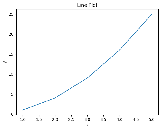
We can plot multiple line plots on the same axes by adding more plt.plot() function calls with the corresponding data.
Scatter Plot
Scatter plots are used to visualize the relationship between two continuous variables. Each data point is plotted as a dot on the graph.
To create a scatter plot in Matplotlib, we pass the x and y arrays to plt.scatter().
import matplotlib.pyplot as plt

x = [1, 2, 3, 4, 5]
y = [2, 5, 4, 7, 5]

plt.title('Scatter Plot')
plt.scatter(x, y)
plt.xlabel('x')
plt.ylabel('y')
plt.show()
This generates the following scatter plot:
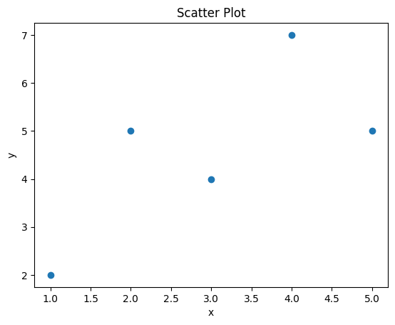
We can observe if there are any patterns or correlations between the x and y data points through visual inspection.
Bar Chart
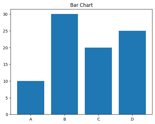
Bar charts are used to compare quantities corresponding to different categories. To plot bars with Matplotlib, we need to provide the height of each bar and their labels.
import matplotlib.pyplot as plt

labels = ['A', 'B', 'C', 'D']
values = [10, 30, 20, 25]

plt.title('Bar Chart')
plt.bar(labels, values)
plt.show()
This code produces a simple vertical bar chart:
We can also generate horizontal bar charts using the plt.barh() method.
import matplotlib.pyplot as plt

labels = ['A', 'B', 'C', 'D']
values = [10, 30, 20, 25]

plt.figure(figsize=(10, 6))
plt.title('Horizontal Bar Chart')
plt.barh(labels, values)
plt.xlabel('Values')
plt.ylabel('Labels')
plt.show()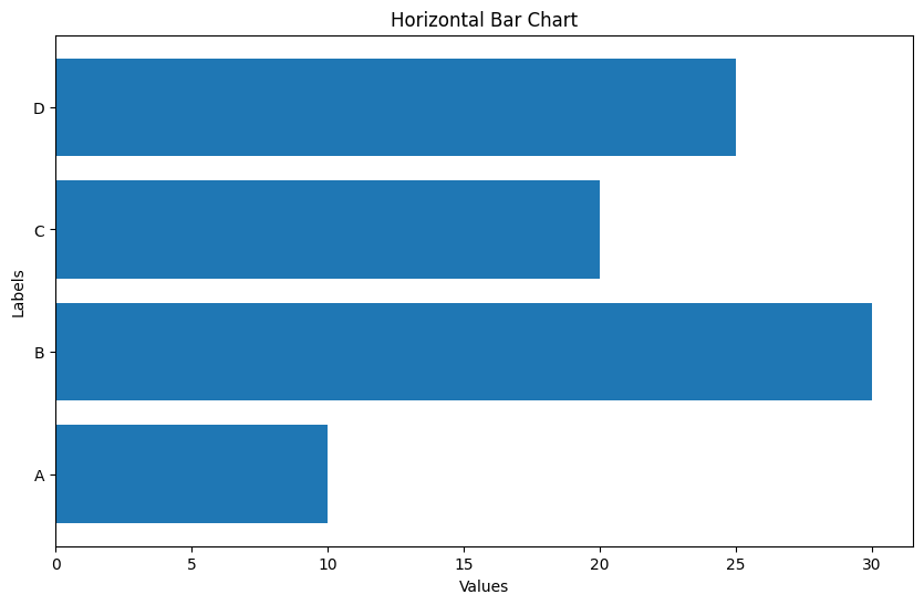
Histogram
Histograms display the frequency distribution of data using bars. To plot a histogram in Matplotlib, we pass the dataset into plt.hist().
import matplotlib.pyplot as plt
import numpy as np

x = np.random.normal(size=1000)

plt.hist(x, bins=25)
plt.title('Histogram')
plt.show()
This generates a histogram with 25 bins:
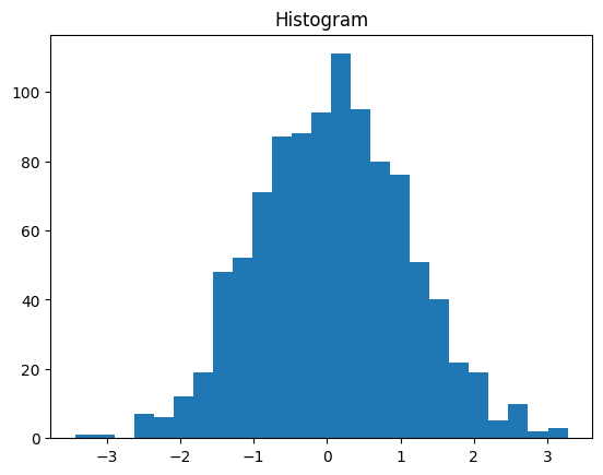
We can adjust the number of bins and other parameters like color to customize the histogram.
Pie Chart
Pie charts visualize data as circular sectors representing the proportion of each quantity. We need to provide the wedge sizes and labels for each sector.
import matplotlib.pyplot as plt

values = [20, 40, 60, 80]
labels = ['A', 'B', 'C', 'D']
explode = [0, 0.2, 0, 0]

plt.pie(values, labels=labels, explode=explode)
plt.title('Pie Chart')
plt.show()
This code creates an exploded pie chart:
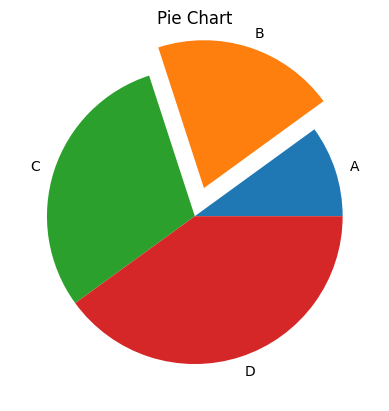
The explode parameter separates out one wedge from the rest for highlight. There are many options available to customize pie charts in Matplotlib.
These examples demonstrate how easily we can generate common plots like line charts, scatter plots, bar charts, histograms and pie charts using Matplotlib’s pyplot module. Now let’s learn how to customize and stylize these plots.
Customizing Plots
Matplotlib provides various options to customize every element of a figure like colors, labels, limits, legend etc. This allows us to generate exactly the visualization we need.
Figure and Axes
In Matplotlib, the overall graphic is contained in a Figure object, and each plot (line, bar etc) is drawn on an Axes object.
We can create multiple plots per figure by adding more Axes objects using fig.add_axes():
import matplotlib.pyplot as plt

fig = plt.figure()

axes1 = fig.add_axes([0.1, 0.5, 0.8, 0.4]) # x, y, width, height
axes2 = fig.add_axes([0.1, 0.1, 0.8, 0.4])

# Plot on each axes
axes1.plot([1,2,3], [4,5,6])
axes2.scatter([1,3,5], [5,2,4])
This generates a figure with two Axes objects containing different plots:
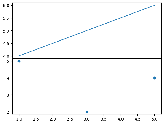
We can customize the look and limits of each Axes as needed. The Figure provides overall styling like background color.
Labels and Titles
We can add descriptive labels and titles to provide context using:
plt.title('Sales Over Time')
plt.xlabel('Date')
plt.ylabel('Revenue')
Multi-line plots should include a legend to identify each line. We can add a legend using:
plt.plot(x1, y1, label='Line 1')
plt.plot(x2, y2, label='Line 2')
plt.legend()
This will generate a legend box identifying each line.
Limits and Scales
We may want to adjust the range of values visible on the plot or change the scale from linear to logarithmic.
Setting limits crops the plot:
plt.xlim([0, 10])
plt.ylim([0, 100])
Changing to a log scale:
plt.xscale('log')
plt.yscale('log')
This makes plots more readable for certain use cases like visualizing exponential data.
Legend
The plot legend identifies the meaning of different lines, bars or regions on the figure. We can position the legend using bbox coordinates:
plt.legend(loc=(1.0, 0.5))Common locations are 'upper left', 'lower right', 'center left' etc. Omitting loc places it in the default best position.
We can also customize the legend appearance by specifying labels, fontsize, color etc.
Annotations
Annotations like arrows, text boxes and shapes can be added to highlight areas or communicate extra details on the plot.
Adding text at a specific data point:
plt.text(2.5, 60, 'Important Point', fontsize=12)Annotating with an arrow:
plt.annotate('Minimum', xy=(x_min, y_min), xytext=(x_min+5, y_min+5), arrowprops=dict(facecolor='black'))Drawing a shape rectangle:
plt.axvspan(xmin, xmax, ymin=0.25, ymax=0.75, alpha=0.5, color='red')There are many more annotation functions available in Matplotlib.
Style and Color
We can customize the overall style of the plot using built-in styles like ‘ggplot’, ‘seaborn’, ‘fivethirtyeight’ etc.
plt.style.use('ggplot')Colors can also be set for individual elements like:
plt.plot(x, y, color='green')
plt.bar(x, y, color='#FF5733')
Supported color formats are hexadecimal, RGB tuple, and HTML color names.
This covers the main options for customizing the different components of a Matplotlib figure. Next, we will look at saving plots to file.
Saving, Showing and Embedding Plots
Matplotlib provides a few ways to save plots to image files using:
plt.savefig('plot.png') # Supported formats: .pdf, .svg, .png, .jpg etc.We can also show() a plot rendering it on the screen:
plt.show()For Jupyter notebooks, we can display the plot embedded within the cell output:
from IPython.display import display

display(plt.gcf())
Some parameters to customize saving:
dpi- Resolution in dots per inchbbox_inches- Saves entire figure areapad_inches- Padding around the figure edge
Now that we have covered the basics, let’s look at some other useful plot types provided by Matplotlib.
Other Types of Plots
Matplotlib supports a wide range of common and specialized plots including:
- Area plots to visualize quantitative data over time
- Contour plots for 3D data
- Polar plots using radial coordinates
- Heatmaps to graphically represent data as colors
- Subplots to draw multiple plots on the same figure
- 3D plots with mplot3d toolkit
- Statistical visualizations like box plots, violin plots, dot plots etc.
For example, creating subplots with shared x and y axes:
fig, axs = plt.subplots(2, 2, sharex=True, sharey=True)

axs[0,0].plot(x, y)
axs[0,1].scatter(x, y)
axs[1,0].bar(x, y)
axs[1,1].hist(x, bins=10)
Contour plot:
x = np.arange(-3, 3, 0.1)
y = np.arange(-3, 3, 0.1)
X, Y = np.meshgrid(x, y)
Z = np.sqrt(X**2 + Y**2)

cp = plt.contourf(X, Y, Z)
The variety of plot types along with customization options make Matplotlib suitable for any visualization need.
Tips for Effective Data Visualization
Here are some tips to create effective, easy-to-understand visualizations with Matplotlib:
- Choose the right plot type based on the data type and relationships being analyzed.
- Focus on communicating insights rather than just the raw data.
- Keep it simple and minimalist to avoid cognitive overload.
- Use titles, labels, legends judiciously to add context without cluttering the visual.
- Pick the color scheme carefully. Use clear, high contrast colors.
- Set appropriate scales, ticks and limits for readability.
- Annotate sparingly to highlight key points. Don’t overload.
- Maintain a high resolution for print-quality output.
- Review the visualization to ensure the conclusions are represented accurately.
- Choosing the most suitable plot type and applying principles of good visual design is key for impactful data visualization with Matplotlib.
Conclusion
In this comprehensive guide, we explored Matplotlib’s key features for data visualization in Python. We covered installation, basic plots like line, scatter, bar, histogram and pie charts. We also learned how to customize every element of the figure and save plots to file. Finally, we looked at tips to create effective, insightful visualizations with Matplotlib.
Matplotlib provides a mature, flexible library to generate publication-quality figures and interactive visuals to gain valuable insights from data. With the basics learned here, you will be ready to start leveraging Matplotlib’s extensive capabilities for your own data science and visualization needs in Python.