Visualization plays a crucial role in analyzing and making sense of complex financial data. Python’s Matplotlib library offers a versatile toolkit for creating informative plots and charts to extract insights from financial time series datasets. This comprehensive guide examines key Matplotlib plotting tools and techniques to build interactive visualizations for finance and trading applications.
Matplotlib is Python’s most popular 2D plotting library and the foundation for many advanced data visualization libraries like Seaborn and Plotly. It provides a MATLAB-style interface for creating publication-quality figures and supports a wide range of graphical capabilities like line plots, bar charts, histograms, scatter plots, animations, and geographical maps. Matplotlib can generate visualizations in many output formats and integrate tightly with NumPy, Pandas, and other Python scientific computing stacks.
This how-to guide will cover the following key topics:
Table of Contents
Open Table of Contents
- Matplotlib Architecture
- Customizing Plot Aesthetics
- Visualizing Time Series Data with Matplotlib, Pandas, and Seaborn
- Visualizing Time Series Data with Real-life Examples
- Creating Candlestick Charts with mplfinance
- Candlestick Charts with Real-life Data
- Volume Overlay Charts
- Volume Overlay Charts with Real-life Example
- Visualizing Correlations with Heatmaps
- Real-life Example: Visualizing Stock Correlations with Heatmaps
- Visualizing Financial Models with 3D Surface Plots
- Creating Animations and Interactive Charts
- Real World Examples
- Conclusion
Matplotlib Architecture
Matplotlib features a procedural interface named pyplot modeled after MATLAB’s plotting functions. It provides a state-based interface for creating figures, axes, plotting functions, and configuring visual aesthetics.
Key components:
-
Figure: Overall container for the visualization. You can have multiple independent figures per script.
-
Axes: Area where the actual plot is rendered, allowing multiple plots per figure.
-
Artist: Visual primitives like Lines, Text, Rectangles that are added to compose the final plot.
Here is a simple example to create a matplotlib figure and axes:
import matplotlib.pyplot as plt

fig = plt.figure()  # Figure
ax = fig.add_subplot()  # Axes

ax.plot([1, 2, 3])

plt.show()
Matplotlib provides a stateful object-oriented API and a MATLAB-style procedural interface named pyplot to accomplish these tasks:
import matplotlib.pyplot as plt

# Object-oriented API
fig, ax = plt.subplots()
ax.plot([1, 2, 3])

# pyplot procedural interface
plt.plot([1, 2, 3])
plt.show()
In most cases, the pyplot interface provides a simpler way to plot and customize visuals without directly instantiating figure/axis objects. But the OO-API offers more control and customization for advanced use cases.
Customizing Plot Aesthetics
Matplotlib provides extensive control over visual styling and customization of every plot element. Here are some common ways to customize the look and feel of matplotlib plots:
Colors: Accept a wide range of color specifications like RGB or hex codes, html color names.
plt.plot([1,2,3], color='red')
plt.bar([1,2,3],[4,5,6], color='#FF5733')
Line Styles: Change line width, dash patterns, marker symbols.
# Line width
plt.plot([1,3,5], linewidth=5.0)

# Dashed line
plt.plot([1,3,5], linestyle='--')

# Markers
plt.plot([1,2,3], marker='x')
Axis Limits: Control x and y axis ranges.
plt.xlim(0, 10)
plt.ylim(-5, 5)
Labels: Customize titles, axes labels, ticks, legends.
plt.title('Sales 2021')
plt.xlabel('Month')
plt.ylabel('Revenue')

plt.legend(['Product 1', 'Product 2'])
Themes: Change overall visual theme and styling.
# Built-in themes
plt.style.use('dark_background')

# Custom rc params
plt.rc('lines', linewidth=4, color='r')
See the full matplotlib customization guide for more details on styling plots.
Visualizing Time Series Data with Matplotlib, Pandas, and Seaborn
Time-series data is commonplace in financial analysis, tracking metrics such as stock prices, exchange rates, and interest rates over time. Spotting trends and understanding seasonality in this type of data is key. Tools like Matplotlib, coupled with libraries like Pandas and Seaborn, can significantly aid in enhancing these visualizations.
Matplotlib provides intuitive methods to plot time-series data, accepting datetime data types on the x-axis for ease of use.
Sample Matplotlib Code
Here’s how you can create a simple time-series plot in Matplotlib:
import matplotlib.pyplot as plt
import matplotlib.dates as mdates
from datetime import datetime

# Define dates and corresponding time-series values
dates = [datetime(2021, 1, 1), datetime(2021, 7, 1), datetime(2021, 12, 31)]
values = [100, 150, 200]

fig, ax = plt.subplots()

# Plot using datetime data for x-axis
ax.plot_date(dates, values, '-')

# Configure datetime format and ticks for x-axis
ax.xaxis.set_major_formatter(mdates.DateFormatter('%Y-%m'))
ax.xaxis.set_major_locator(mdates.YearLocator())

plt.show()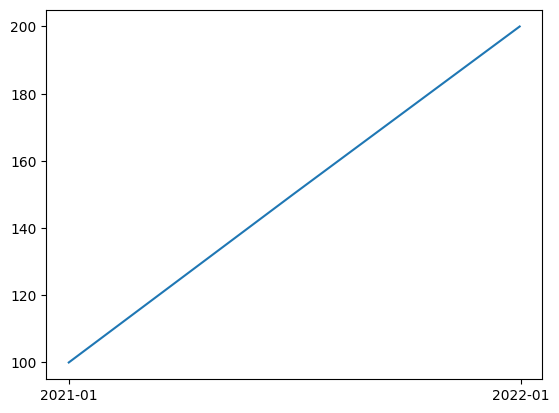
The key steps involve passing datetime data for x-axis values, using the plot_date function instead of the regular plot function, and formatting the datetime ticks and labels using DateFormatter and YearLocator.
Pandas Integration
Integrating with Pandas, a powerful data manipulation and analysis tool, enhances these visualizations. For instance, when tracking a stock’s closing prices over several days, you can leverage Pandas’ plotting capabilities with minimal lines of code. We will demonstrate this using a hypothetical time series of closing stock prices for a company ‘LLEGO’ over 10 days.
Sample data for LLEGO's closing stock prices:
| date | close |
|---|---|
| 2021-01-01 | 100 |
| 2021-01-02 | 101.5 |
| 2021-01-03 | 100.7 |
| 2021-01-04 | 102.2 |
| 2021-01-05 | 102.5 |
| 2021-01-06 | 103.1 |
| 2021-01-07 | 102.9 |
| 2021-01-08 | 103.5 |
| 2021-01-09 | 104.2 |
| 2021-01-10 | 104.5 |
import pandas as pd
import matplotlib.pyplot as plt

# Create a DataFrame
df = pd.DataFrame({
    'date': pd.date_range(start='1/1/2021', periods=10),
    'close': [100, 101.5, 100.7, 102.2, 102.5, 103.1, 102.9, 103.5, 104.2, 104.5]
})

fig, ax = plt.subplots()

# Plot the data
df.plot(x='date', y='close', kind='line', ax=ax, linestyle='-', color='b')

# Set labels
ax.set_ylabel('Price')
ax.set_title('LLEGO Stock')

# Rotate and align the x labels
fig.autofmt_xdate()

plt.show()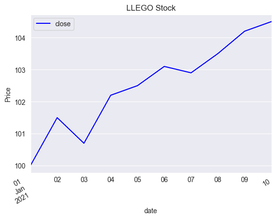
This line plot displays the closing price trend over time for ‘LLEGO’ stocks in blue. The x-axis dates are automatically rotated for better readability.
Seaborn Integration
To further improve aesthetics and apply attractive styles, you can integrate with Seaborn, a statistical data visualization library based on Matplotlib. Seaborn’s lineplot function, for instance, can create a sleek time-series plot:
import pandas as pd
import matplotlib.pyplot as plt
import matplotlib.dates as mdates
import seaborn as sns

# Prepare data
data = {
    'date': pd.date_range(start='1/1/2021', periods=10),
    'close': [100, 101.5, 100.7, 102.2, 102.5, 103.1, 102.9, 103.5, 104.2, 104.5]
}

# Convert data to DataFrame
df = pd.DataFrame(data)

# Set Seaborn style
sns.set_style("darkgrid")

# Create plot
fig, ax = plt.subplots()

# Rotate and align the x labels
fig.autofmt_xdate()

# Format x-axis to display dates correctly
ax.xaxis.set_major_locator(mdates.DayLocator(interval=1))
ax.xaxis.set_major_formatter(mdates.DateFormatter('%Y-%m-%d'))

# Creating line plot
sns.lineplot(x='date', y='close', data=df, ax=ax)

# Axis Labels
ax.set_ylabel('Price')
ax.set_title('LLEGO Stock')

# Show plot
plt.show()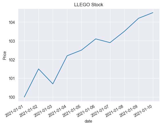
In the code above, Seaborn’s lineplot function is used to create a clean and aesthetically pleasing time-series plot. We also benefit from Seaborn’s enhanced color palettes and style settings, which can be customized to make the visualization more impactful. The use of Seaborn is practical when creating more complex graphs, as it tends to require less code than Matplotlib.
Thanks to the synergistic interplay between Matplotlib, Pandas, and Seaborn, visualizing time-series financial data becomes not only accessible but also deeply customizable and aesthetically pleasing.
Visualizing Time Series Data with Real-life Examples
Time series data, a sequence of data points recorded over consistent time intervals, is fundamental to financial data analysis. Variables like stock prices, exchange rates, and interest rates are commonly tracked as time-series data. Python libraries like matplotlib, pandas, and seaborn offer powerful tools for visualizing these trends in time series data.
In this guide, we’ll explore how to create time series visualizations using matplotlib, pandas, and seaborn with real-life market data for Apple Inc. (“AAPL”), obtained from Yahoo Finance.
Matplotlib
Matplotlib is a core Python library for creating static, animated, and interactive visualizations. Here’s how to visualize Apple’s stock price data as a time series using matplotlib:
# Importing necessary libraries
import pandas as pd
from pandas_datareader import data as pdr
import yfinance as yf
import matplotlib.pyplot as plt
import matplotlib.dates as mdates

yf.pdr_override()

# Download historical market data for Apple Inc.
df = pdr.get_data_yahoo('AAPL', start="2020-01-01", end="2021-12-31")

# Create a Figure and an Axes object
fig, ax = plt.subplots()

# Plot using datetime data for x-axis
ax.plot_date(df.index, df['Close'], '-')

# Set datetime format for x-axis
ax.xaxis.set_major_formatter(mdates.DateFormatter('%Y-%m'))

# Set datetime ticks using `MonthLocator`
ax.xaxis.set_major_locator(mdates.MonthLocator(interval=3))

# Auto-format the date labels
fig.autofmt_xdate()

# Display the plot
plt.show()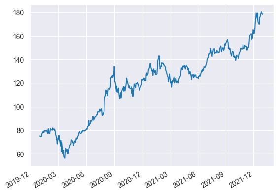
The plot displays the closing price for AAPL over time.
Pandas
Pandas not only excels at data manipulation, but it is also convenient for creating visualizations. You can plot the same data using pandas:
# Importing necessary libraries
import pandas as pd
from pandas_datareader import data as pdr
import yfinance as yf
import matplotlib.pyplot as plt

yf.pdr_override()

# Download historical market data for Apple Inc.
df = pdr.get_data_yahoo('AAPL', start="2020-01-01", end="2021-12-31")

# Create plot
fig, ax = plt.subplots(figsize=(12, 6))

# Creating line plot
df['Close'].plot(kind='line', ax=ax)

# Axis Labels
ax.set_ylabel('Closing Price')
ax.set_xlabel('Date')
ax.set_title('AAPL Stock 2020-2021')

# Rotate and align the x labels
fig.autofmt_xdate()

plt.show()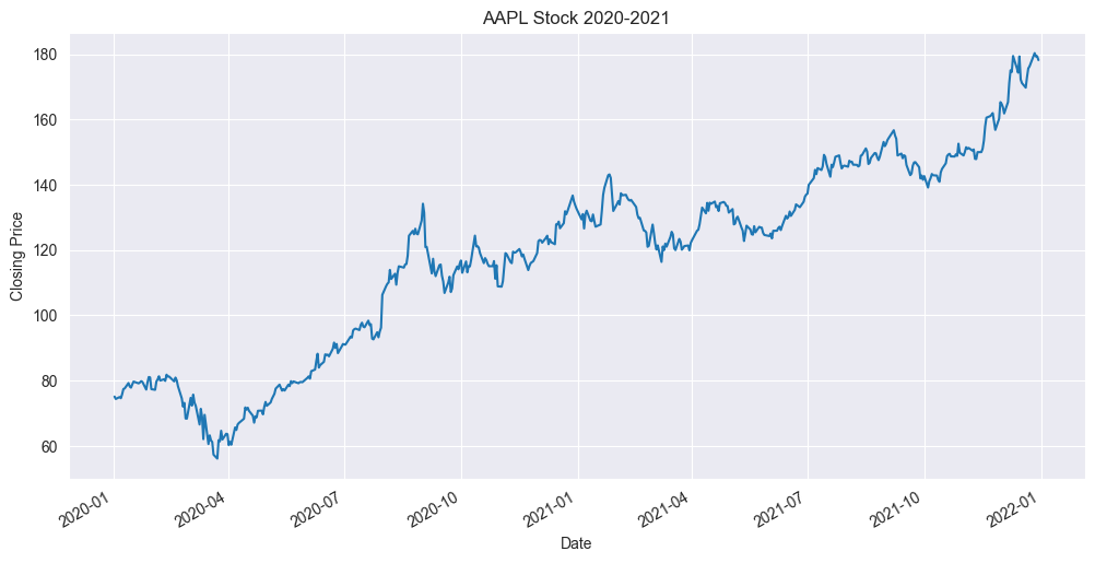
This line plot shows the AAPL closing price over time.
Seaborn
Seaborn is another powerful Python library for enhanced data visualization, especially for statistical graphics. Seaborn extends the capabilities of matplotlib and integrates well with pandas. Let’s create a similar time-series plot using seaborn:
# Importing necessary libraries
import matplotlib.pyplot as plt
import matplotlib.dates as mdates
import seaborn as sns
from pandas_datareader import data as pdr
import yfinance as yf

yf.pdr_override()

# Download historical market data for Apple Inc.
df = pdr.get_data_yahoo('AAPL', start="2020-01-01", end="2021-12-31")

# Seaborn style
sns.set_style("darkgrid")

# Create a Figure and an Axes object
fig, ax = plt.subplots(figsize=(12, 6))

# Rotate and align the x-labels
fig.autofmt_xdate()

# Plotting the data using Seaborn
sns.lineplot(data=df, x=df.index, y="Close", ax=ax)

# Set datetime format for x-axis
ax.xaxis.set_major_locator(mdates.MonthLocator(interval=3))
ax.xaxis.set_major_formatter(mdates.DateFormatter('%Y-%m'))

# Setting x and y labels
ax.set_xlabel("Date")
ax.set_ylabel("Closing Price")
ax.set_title('AAPL Stock 2020-2021')

plt.show()
This code uses seaborn to plot a line chart of Apple’s closing stock prices from the years 2020-2021.
These visualizations provide a clear representation of Apple’s stock price movements over time, demonstrating the power of Python’s capabilities for financial data visualization.
Creating Candlestick Charts with mplfinance
Candlestick charts are specialized visualizations used in finance. They depict the open, high, low, and close prices of a financial instrument, such as a stock, over a particular time period. They are instrumental for traders and financial analysts, offering a rich source of information at a glance.
In older versions of Matplotlib, the creation of candlestick charts was managed with the matplotlib.finance module. However, since the deprecation of this module in Matplotlib v3.0.0, the mplfinance package (a spin-off from Matplotlib) has taken over to handle this type of plot.
Below is an example of creating a candlestick chart using mplfinance:
import mplfinance as mpf
import pandas as pd
from datetime import datetime

# Sample OHLC data
data = {
     'Open': [10, 15, 14, 12, 13],
     'High': [15, 16, 15, 14, 14],
     'Low': [9, 12, 13, 11, 12],
     'Close': [12, 14, 13, 13, 14]
}

time_index = pd.DatetimeIndex([
      datetime(2021, 1, 1),
      datetime(2021, 1, 2),
      datetime(2021, 1, 3),
      datetime(2021, 1, 4),
      datetime(2021, 1, 5)
])

# Create a DataFrame with the OHLC data and the time index
df = pd.DataFrame(data, index=time_index)

# Configure and plot the candlestick chart
mpf.plot(df, type='candle', style='yahoo',
         title='Sample Candlestick Chart',
         ylabel='Price')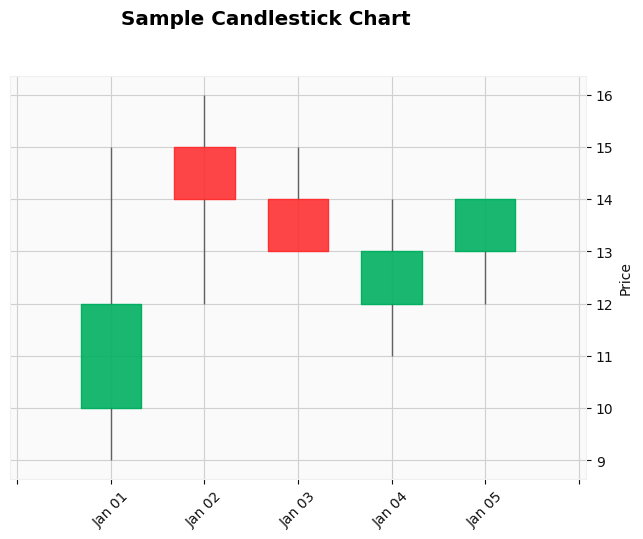
The color representation in the candlestick chart is as follows:
- A green candle is displayed if the closing price is higher than the opening price.
- A red candle is shown if the closing price is lower than the opening price.
- The wick illustrates the range from low to high prices.
The mplfinance package offers various customization options – including color, width, and transparency. It even allows handling date formatting on the x-axis.
Candlestick charts are not only visually appealing but also encode a substantial amount of information within a compact space. They are thus considered indispensable tools for financial analysts and traders.
Candlestick Charts with Real-life Data
Creating a candlestick chart with real-life data offers a more practical understanding of its utility in finance. For this purpose, we’ll use the Yahoo Finance data for a particular stock and create the candlestick chart using the mplfinance package.
In this example, we will fetch the historical data for Apple Inc. (“AAPL”) for the year 2021:
import mplfinance as mpf
import yfinance as yf

# Fetch the historical market data of Apple Inc.
df = yf.download('AAPL', start="2021-01-01", end="2022-01-01")

# Plot the candlestick chart
mpf.plot(df, type='candle', style='yahoo',
         title='Apple Inc. (2021)', ylabel='Price ($)')
Running this script would download the historical market data for Apple Inc. from Yahoo Finance and then draw a candlestick chart for it. The chart uses the Yahoo-style in mplfinance, which presents green/red bars (candles) to illustrate whether the closing price was higher/lower than the opening price for a given day. The wicks on the bars represent the highest and lowest trading price for each day.
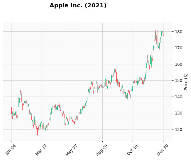
Practical usage of the candlestick chart like this can help investors make informed decisions about buying and selling stocks. It provides important information about the open, close, high, and low price for each trading interval. Hence, it can shed light on potential trends in the stock’s price and offer valuable insights that are not immediately apparent in numerical data.
Volume Overlay Charts
Volume information can offer valuable insights into the supply-demand dynamics and trading volume patterns.
Volume bars can be overlaid into price charts for a better visual perspective. Here is revised code to overlay a volume plot:
import pandas as pd
import matplotlib.pyplot as plt
from datetime import datetime

# Example DataFrame with OHLC and volume data
df = pd.DataFrame({
     'Open': [10, 15, 14, 12, 13],
     'High': [15, 16, 15, 14, 14],
     'Low': [9, 12, 13, 11, 12],
     'Close': [12, 14, 13, 13, 14],
     'Volume': [100, 120, 80, 105, 125],
}, index=[
      datetime(2021, 1, 1),
      datetime(2021, 1, 2),
      datetime(2021, 1, 3),
      datetime(2021, 1, 4),
      datetime(2021, 1, 5)
])

fig, (ax1, ax2) = plt.subplots(2, 1, sharex=True)

# Price chart
df['Close'].plot(ax=ax1, color='black')
ax1.set_ylabel('Price')

# Volume bar chart
df['Volume'].plot(ax=ax2, kind='bar', color='blue')
ax2.set_ylabel('Volume')

# Formatting
ax1.grid(False)
plt.setp(ax1.get_xticklabels(), visible=False) # Hide x-labels
plt.suptitle('LLEGO Price and Volume')

plt.show()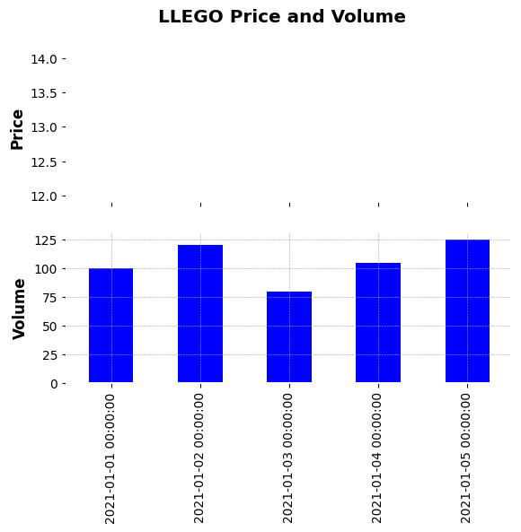
This generates a composite chart with price as a line plot on the top part and volume bars at the bottom part. The two axes are aligned and share the x-axis. Besides this, other types of price/volume overlay views are possible, for example, adding the volume line plot overlaid on the price plot itself.
Volume Overlay Charts with Real-life Example
Market data provides insight into financial trends and trading volume patterns. In particular, volume information is critical because it reflects the intensity of trading and the consensus among traders about price levels.
The following Python code uses the yfinance package to download Yahoo Finance data for Apple Inc. (“AAPL”). It then overlays volume data below a line chart of the daily closing prices to create a more comprehensive view of the stock’s performance.
# Install the yfinance package if it's not installed yet
!pip install yfinance

import yfinance as yf
import matplotlib.pyplot as plt

# Download historical market data of Apple Inc.
df = yf.download('AAPL', start="2021-01-01", end="2021-12-31")

fig, axes = plt.subplots(nrows=2, ncols=1, sharex=True, figsize=(15,10),
                        gridspec_kw={'height_ratios': [2, 1]})

# Price chart
df['Close'].plot(ax=axes[0], color='black')
axes[0].set_ylabel('Price')
axes[0].grid(False)

# Volume bar chart
df['Volume'].plot(ax=axes[1], kind='bar', color='blue', alpha=0.3)
axes[1].set_ylabel('Volume')

plt.title('Apple (AAPL) Price and Volume 2021', fontsize=16)
plt.show()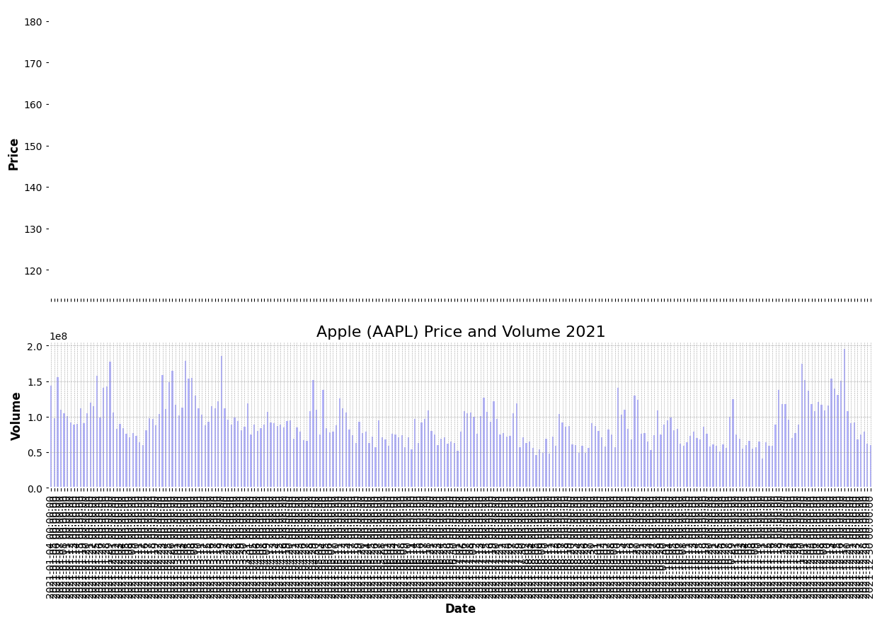
This script generates a composite chart with a line plot of Apple’s daily closing prices in 2021 on the upper portion and corresponding trading volumes as a bar chart on the lower portion. The two charts share the X-axis, representing time. This visualization can help identify periods when trading volumes spiked or dipped and how these corresponded with changes in the stock price.
By providing both price and volume, we create a plot that offers a richer perspective on market dynamics. This is valuable for investors or traders who are investigating potential correlations and seeking to understand the stock’s activity throughout the year.
Visualizing Correlations with Heatmaps
Heatmaps are two-dimensional graphical representations where individual values are represented as colors. This makes heatmaps exceptionally effective for visualizing correlations across multiple datasets.
Matplotlib’s imshow() function from the pyplot module provides an efficient way to generate heatmaps.
Below is an example code to depict a heatmap for a correlation matrix of stock returns:
import numpy as np
import matplotlib.pyplot as plt

# Randomly generated correlation matrix
np.random.seed(0)  # for reproducibility
corr_matrix = np.random.rand(10, 10)

# Create heatmap
fig, ax = plt.subplots()
cax = ax.matshow(corr_matrix, cmap='coolwarm')  # Using matshow() function to plot matrix

# Display values in each cell
for (i, j), z in np.ndenumerate(corr_matrix):
    ax.text(j, i, '{:0.2f}'.format(z), ha='center', va='center',
            bbox=dict(boxstyle='round', facecolor='white', edgecolor='0.3'))

# General settings
ax.set_xticks(np.arange(len(corr_matrix)))
ax.set_yticks(np.arange(len(corr_matrix)))
ax.set_xticklabels(list("ABCDEFGHIJ"))
ax.set_yticklabels(list("ABCDEFGHIJ"))
ax.set_title("Correlation Matrix Heatmap")
plt.colorbar(cax)
plt.show()
This script generates a 10x10 correlation matrix depicted as a heatmap, with individual cell values annotated.
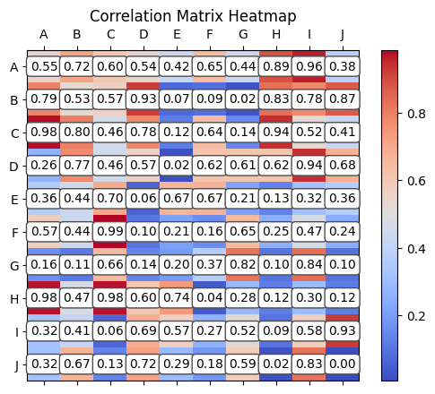
Heatmaps excel at revealing correlations, patterns, and outliers in complex multidimensional data, making them particularly useful for visualizing stock correlations, portfolio risk, macroeconomic data, and more. The color-coding offers an instant visual summary of information, highlighting areas of interest and sharpening the visual acuity of data analytics.
Real-life Example: Visualizing Stock Correlations with Heatmaps
Heatmaps are a valuable tool in data visualization, providing an immediate, intuitive way to represent complex datasets. The color gradation allows for the identification of patterns, trends, and disparities.
A particularly insightful application of heatmaps is in the financial sector, where they can be used to visualize the correlation between different stocks. This is a crucial aspect of investment portfolio diversification as investing in stocks with high correlations could aggravate risk.
In the example detailed below, we use real stock data from Yahoo Finance to depict a correlation heatmap. The stocks chosen for this exercise are Apple (AAPL), Microsoft (MSFT), Google (GOOGL), Amazon (AMZN), and Netflix (NFLX).
# Install the yfinance package if it's not already installed
!pip install yfinance pandas seaborn

import yfinance as yf
import seaborn as sns
import matplotlib.pyplot as plt

# Define the ticker symbols for the stocks we want to download
tickers = ['AAPL', 'MSFT', 'GOOGL', 'AMZN', 'NFLX']

# Download the data
data = yf.download(tickers, start="2020-01-01", end="2021-12-31")['Adj Close']

# Compute the correlation matrix
corr_matrix = data.pct_change().apply(lambda x: np.log(1+x)).corr()

# Create a heatmap
plt.figure(figsize=(8,8))
sns.heatmap(corr_matrix, annot=True, fmt=".2f", square=True, cmap='coolwarm',
            cbar_kws={"shrink": .82}, linewidths=.5, annot_kws={"size": 12})
plt.title('Real-life Example: Correlation Matrix Heatmap for Tech Stocks')
plt.show()
This Python script downloads the adjusted closing prices for the five selected tech companies from Yahoo Finance. It calculates the daily return percentage change, applies a logarithmic function to normalize both positive and negative variances, and subsequently computes a correlation matrix. Finally, it generates a heatmap using the Seaborn library, which offers an enhanced interface to Matplotlib for the creation of aesthetically pleasing statistical plots.
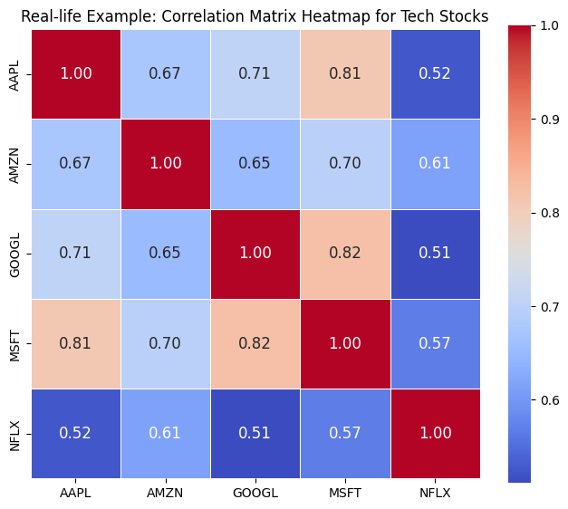
The resulting heatmap reveals the level of correlation between each pair of stocks. Lighter cells denote a higher positive correlation, whereas darker cells represent either a low correlation or a negative correlation (where one stock’s value increases as the other decreases).
This form of visualization proves particularly valuable for diversification in portfolio management. It enables investors to strategically select investments that aren’t strongly correlated, thereby lowering risk. In addition, heatmaps provide a quick visual summary of potential market trends influencing the selected group of stocks.
Visualizing Financial Models with 3D Surface Plots
Three-dimensional plots offer an effective way to visualize financial models, where the representation of multi-variable data becomes crucial. Matplotlib’s mplot3d toolkit enables the creation of a variety of 3D plots, including scatter, line, surface, and wireframe plots.
In the example below, a 3D surface plot visualizes a financial model. Here, a parabolic surface is created to illustrate the concept:
from mpl_toolkits.mplot3d import Axes3D
import matplotlib.pyplot as plt
import numpy as np

fig = plt.figure(figsize=(8,6))
ax = fig.add_subplot(111, projection='3d')

# Create data
x = np.linspace(-5, 5, 101)  # linspace ensures even distribution
y = np.linspace(-5, 5, 101)
x, y = np.meshgrid(x, y)

# Example parabolic function
z = x**2 + y**2

# Creating 3D surface plot
surf = ax.plot_surface(x, y, z, cmap='jet', edgecolor='k')

# Add a color bar which maps values to colors
fig.colorbar(surf, shrink=0.5, aspect=5)

ax.set_xlabel('X')
ax.set_ylabel('Y')
ax.set_zlabel('Z = f(X,Y)')
ax.set_title('3D Surface Plot of a Parabolic Function')

plt.show()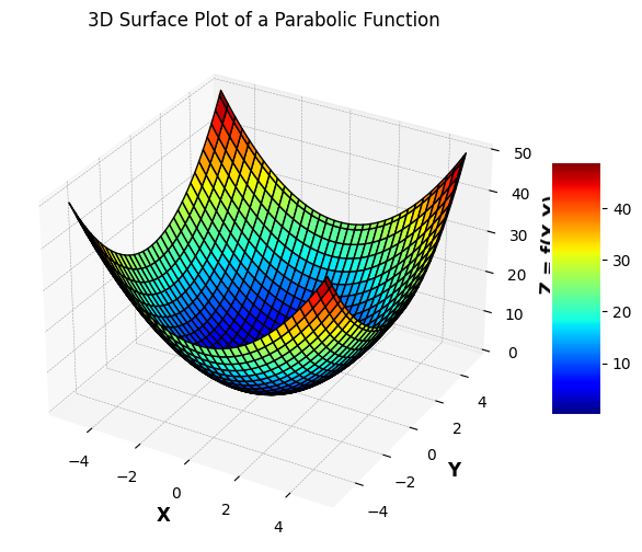
This script results in a 3D surface plot displaying the parabolic function f(x, y) = x² + y² over the (x, y) domain.
3D surface plots, such as the one shown above, can play an important role in quantitative finance and economics. These are particularly useful when visualizing multi-variable models and financial surfaces. Overlaying heatmap projections can add another layer of depth, enabling a more nuanced understanding of patterns and relationships in the data.
Creating Animations and Interactive Charts
Animations offer a dynamic way to visualize time-series data, bringing the trends and anomalies over time to life. Matplotlib has inherent support for animations and interactive charts.
The code snippet below demonstrates how to create an animated time series plot:
import matplotlib.pyplot as plt
import matplotlib.animation as animation
import numpy as np

fig, ax = plt.subplots()
xdata, ydata = [], []
ln, = plt.plot([], [], 'ro', animated=True)

# Initializing the plot with empty data
def init():
    ax.set_xlim(0, 100)  # Setting x-axis limits
    ax.set_ylim(0, 10)  # Setting y-axis limits
    return ln,

# Animation function that will generate data for each frame
def update(frame):
    xdata.append(frame)
    ydata.append(np.random.randint(0, 10))
    ln.set_data(xdata, ydata)
    return ln,

# Create the animation
ani = animation.FuncAnimation(fig, update, frames=range(0, 101),
                              init_func=init, blit=True)

# Saving the animation
ani.save("animation.gif", writer='imagemagick')

plt.show()
This code continuously updates the data points, simulating a real-time streaming of data with an animated line chart. This sort of “live” visualization can be extremely useful for observing real-time data trends such as stock price movements.
Moreover, Matplotlib supports interactive chart features like zooming and panning. For a more enhanced interactivity including tooltips, other packages such as mpl_interactions or plotly can be utilized.
These interactive visualizations significantly bolster the process of financial data analysis and exploration by letting users manipulate the view to focus on specific details.
Real World Examples
Let’s walk through some real-world examples of leveraging Matplotlib’s API for financial analytics and trading strategies:
Backtesting trading strategies: Use Matplotlib’s versatile plotting API to analyze backtest results and generate insightful plots like equity curves, drawdowns, rolling returns etc. These visualizations are invaluable for quantifying and improving strategy performance.
Algorithmic trading dashboard: Create live updating plots and metrics that serve as visual indicators for algorithmic trading systems. For example, integrate interactive candlestick charts linked to market data feeds using Matplotlib’s animation module.
Portfolio optimization: Plot efficient frontiers and overlay optimized portfolios to visualize portfolio risks and returns for different asset allocations using Matplotlib’s 3D plotting tools. Heatmaps of asset correlations are also useful.
Economic research: Matplotlib’s statistical plotting features like hist, boxplot and distplot are useful for visualizing economic indicators and gaining insights from macroeconomic data.
Financial modelling: Use line plots, 3D surfaces and wireframes to visually interpret results from financial models implemented in Python.
Conclusion
Matplotlib offers extensive capabilities for crafting effective, publication-quality visualizations tailored for financial analysis use cases. Mastering Matplotlib is essential for using Python for trading, quantitative finance, fintech and financial data science.
The key strengths of Matplotlib are its flexible object-oriented architecture, simple but powerful plotting API, and rich customization options enabling full control over all visual aspects. Matplotlib integrates seamlessly with Python’s leading data analysis libraries like NumPy, Pandas, SciPy making it easy to go from data to insight using Python.
This guide provided an overview of core plotting tools like time series visualizations, customized candlestick charts, heatmaps and animations that are indispensable for financial analysts. Matplotlib enables Python developers to create interactive dashboards, backtesting environments and data-driven financial applications that combine quantitative rigor with visual insights.