3D plotting allows you to visualize data in three dimensions. This can reveal insights and patterns in complex data that are not visible in 2D plots. Matplotlib is one of the most widely used Python packages for 2D and 3D data visualization. It provides a rich API and several plotting functions to generate different types of 3D plots.
In this guide, we will provide an overview of 3D plotting capabilities in Matplotlib. We will cover the basic concepts and show how to create various 3D plot types such as surface, wireframe, scatter, and bar plots. Example code snippets are provided to illustrate the usage and capabilities of Matplotlib for 3D data visualization.
Table of Contents
Open Table of Contents
Prerequisites
Before we dive into the examples, let’s go over some prerequisites:
- Basic knowledge of Python programming
- Matplotlib installed. You can install it using
pip install matplotlib - NumPy installed. Install using
pip install numpy - Data to plot in 3D format
- Jupyter Notebook or any Python environment to run the code
3D Plotting Concepts
3D Coordinate System
The key difference between 2D and 3D plots is the coordinate system. 3D plots use a three-dimensional Cartesian coordinate system with the x, y, and z axes:
- x and y axes are the same as in 2D plots
- z axis represents depth/height
So any point in 3D space is defined using the (x, y, z) coordinates.
Projections
To display 3D data on a 2D surface like your screen, projections are used. The 3D coordinates are transformed into a 2D plane by the projection.
Some common types of 3D projections in Matplotlib:
-
Perspective projection: Mimics human vision, distant objects appear smaller. Parallel lines converge into vanishing points.
-
Orthographic projection: Parallel projection, preserves relative distances. No vanishing points.
-
Other projections: Matplotlib supports setting a custom 3D projection as well using the
projectionkeyword argument.
Plotting Functions
The main 3D plotting functions provided by Matplotlib are:
axes3d.plot_surface()- 3D surface plotaxes3d.plot_wireframe()- 3D wireframe plotaxes3d.scatter()- 3D scatter plotaxes3d.bar()- 3D bar chartaxes3d.plot()- General 3D line plot
We will look at examples of generating each of these plots in the following sections.
3D Surface Plots
A 3D surface plot shows a functional relationship between two independent variables x and y, and one dependent variable z. It displays the shape of a 3D surface generated from data values. Some common examples are 3D terrain, mathematical functions like spheres, or data spread across 3D space.
The axes3d.plot_surface() method can be used to create a variety of 3D surface plots. Let’s go through a few examples.
Plotting a Sphere
We can visualize a sphere using the equation:
x**2 + y**2 + z**2 = r**2Where r is the radius. We generate the data arrays for x, y, z and plot the sphere as:
import matplotlib.pyplot as plt
from matplotlib import cm
from matplotlib.ticker import LinearLocator
import numpy as np

# Generate data
r = 1
n_points = 100
x = np.outer(np.linspace(-r, r, n_points), np.ones(n_points))
y = x.copy().T  # transpose
valid_indices = x**2 + y**2 <= r**2  # Only consider valid points within the sphere
z = np.zeros_like(x)
z[valid_indices] = np.sqrt(r**2 - x[valid_indices]**2 - y[valid_indices]**2)

# Plot
fig = plt.figure()
ax = plt.axes(projection='3d')

ax.plot_surface(x, y, z, cmap=cm.coolwarm, linewidth=0, antialiased=False)

# Customize plot
ax.set_xlim(-1, 1)
ax.set_ylim(-1, 1)
ax.set_zlim(-1, 1)
ax.set_title('Sphere')

plt.show()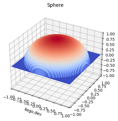
import matplotlib.pyplot as plt
from matplotlib import cm
from matplotlib.ticker import LinearLocator
from matplotlib.animation import FuncAnimation
from IPython.display import HTML
import numpy as np

# Generate data
r = 1
n_points = 100
x = np.outer(np.linspace(-r, r, n_points), np.ones(n_points))
y = x.copy().T  # transpose
valid_indices = x**2 + y**2 <= r**2  # Only consider valid points within the sphere
z = np.zeros_like(x)
z[valid_indices] = np.sqrt(r**2 - x[valid_indices]**2 - y[valid_indices]**2)

# Create a function to update the plot for animation
def update(frame):
    ax.cla()  # Clear the previous frame
    ax.set_xlim(-1, 1)
    ax.set_ylim(-1, 1)
    ax.set_zlim(-1, 1)
    ax.set_title('Sphere')

    # Rotate the sphere
    ax.view_init(elev=10, azim=frame)

    # Plot the updated surface
    ax.plot_surface(x, y, z, cmap=cm.coolwarm, linewidth=0, antialiased=False)

# Create a 3D plot
fig = plt.figure()
ax = plt.axes(projection='3d')

# Create the animation
ani = FuncAnimation(fig, update, frames=np.arange(0, 360, 5), repeat=False)

# Display the animation in Jupyter Notebook
HTML(ani.to_jshtml())
In this example, we first generated x, y meshgrid arrays using NumPy and calculated the z value for each point. We then passed the x, y, z arrays to plot_surface() along with the colormap.
By default, a solid shaded surface is drawn. We can change it to wireframe style using linewidth argument. Various customizations like axis limits, title can be added as well.
Plotting Mathematical Functions
We can visualize mathematical functions in 3D by evaluating the function on a grid of x and y values.
As an example, let’s plot the 3D surface for sinc function:
import numpy as np
import matplotlib.pyplot as plt
from matplotlib import cm
from matplotlib.ticker import LinearLocator

# Generate data
x = np.outer(np.linspace(-3, 3, 30), np.ones(30))
y = x.copy().T

z = np.sinc(np.sqrt(x**2 + y**2))

# Plot
fig = plt.figure()
ax = plt.axes(projection='3d')

ax.plot_surface(x, y, z, cmap=cm.coolwarm, linewidth=0, antialiased=False)
ax.set_xlim(-3, 3)
ax.set_ylim(-3, 3)
ax.set_title('Sinc Function Peaks')

plt.show()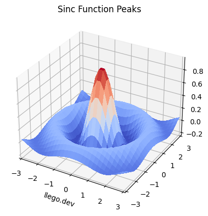
We evaluated the sinc function over a grid of x and y values stored in meshgrid arrays. This generated the z data to produce the 3D plot.
We can visualize many mathematical functions like this in 3D using Matplotlib.
Plotting 3D Terrain
Surface plots are commonly used to visualize 3D geographical terrain data. Let’s see how to plot a 3D surface of a volcano crater using some sample data.
import matplotlib.pyplot as plt
from matplotlib import cm
from matplotlib.ticker import LinearLocator
import numpy as np

# Load data
x = np.linspace(-6, 6, 30)
y = np.linspace(-6, 6, 30)
X, Y = np.meshgrid(x, y)

Z = 3 * (1-X)**2 * np.exp(-(X**2) - (Y+1)**2) - 10*(X/5 - X**3 - Y**5)*np.exp(-X**2-Y**2) - 1/3*np.exp(-(X+1)**2 - Y**2)

# Plot surface
fig = plt.figure()
ax = plt.axes(projection='3d')

ax.plot_surface(X, Y, Z, rstride=1, cstride=1,
                cmap='viridis', edgecolor='none')
ax.set_title('Volcano Crater')
ax.set_xlabel('X')
ax.set_ylabel('Y')
ax.set_zlabel('Z')
ax.view_init(60, 35)

plt.show()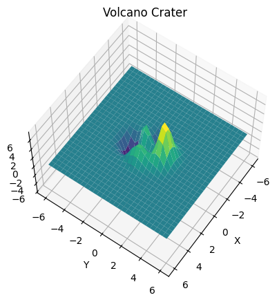
We loaded a sample numerical dataset for the terrain heights and generated meshgrid arrays. By passing the X, Y, Z arrays to plot_surface(), the 3D surface is produced.
We set the colormap to ‘viridis’ and rotated the 3D view using view_init() to get a better perspective of the volcano crater.
Contour Plots on Surfaces
It is also possible to generate contour plots on 3D surfaces. This allows visualizing a secondary set of data values on the surface geometry.
Here is an example of adding contour lines to the volcano crater surface:
import matplotlib.pyplot as plt
from matplotlib import cm
from matplotlib.ticker import LinearLocator
import numpy as np

# Load data
x = np.linspace(-6, 6, 30)
y = np.linspace(-6, 6, 30)
X, Y = np.meshgrid(x, y)

Z = 3 * (1-X)**2 * np.exp(-(X**2) - (Y+1)**2) - 10*(X/5 - X**3 - Y**5)*np.exp(-X**2-Y**2) - 1/3*np.exp(-(X+1)**2 - Y**2)

# Create a plot
fig, ax = plt.subplots(subplot_kw={"projection": "3d"})

# Plot surface
surf = ax.plot_surface(X, Y, Z, cmap='viridis', edgecolor='none')

# Customize the z axis
ax.zaxis.set_major_locator(LinearLocator(10))

# Add a color bar
fig.colorbar(surf, shrink=0.5, aspect=5)

# Add contour plot inside
cset = ax.contourf(X, Y, Z, zdir='z', offset=-2, levels=10, alpha=0.5, cmap='viridis')

ax.set_title('Volcano Crater with Contour')
ax.set_xlabel('X')
ax.set_ylabel('Y')
ax.set_zlabel('Z')
ax.view_init(60, 35)

plt.show()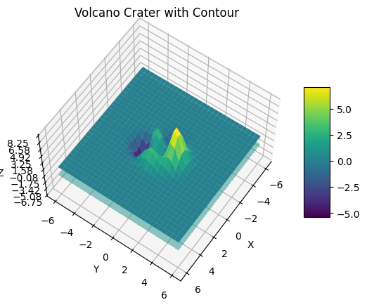
The contour lines are added using the contourf() method by specifying the x, y, z data along with contour options like levels and colors.
This allows visualizing additional data patterns on the 3D surface geometry.
Surface Animation
We can create animated 3D surface plots by updating the data values and re-plotting the surface repeatedly.
Here is an example that generates an animated 3D surface sine wave:
import matplotlib.pyplot as plt
import numpy as np
from matplotlib import animation

# Create figure
fig = plt.figure()
ax = plt.axes(projection='3d')

# Generate the grids
xs = np.linspace(-6, 6, 30)
ys = np.linspace(-6, 6, 30)
X, Y = np.meshgrid(xs, ys)

# Init only required for blitting to give a clean slate.
def init():
  ax.plot_surface(X, Y, Z, cmap='viridis', linewidth=0, antialiased=False)
  return fig

def animate(i):
  t = 0.1 * i

  Z = np.cos(X + t) * np.sin(Y + t)

  # Update the z data
  surf.set_3d_properties(Z)

  return fig

# Add plot
surf = ax.plot_surface(X, Y, Z, cmap='viridis', linewidth=0, antialiased=False)

# Run animation
ani = animation.FuncAnimation(fig, animate, init_func=init, frames=200, blit=False, interval=20, repeat=True)

plt.show()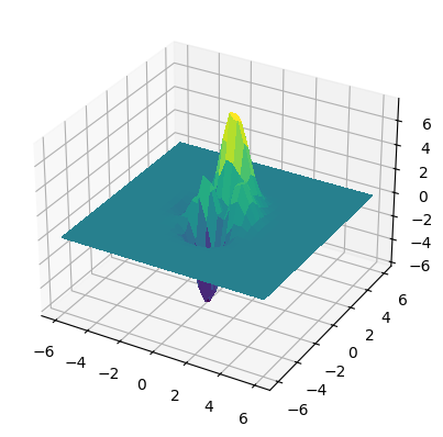
We initialize the 3D surface plot once. Then inside the animation function, the z data is updated by evaluating a sine function. Set this new Z data on the surface and redraw.
This animation can be saved as a GIF using:
ani.save('sine_wave.gif', writer='imagemagick', fps=30, bitrate=1800)By changing the function, different animated 3D surfaces can be created like waves, terrain flyovers, etc.
3D Wireframe Plots
Wireframe plots display the 3D surface geometry using a wire-like mesh instead of solid colored faces. This approach allows us to visualize the underlying structure of the surface.
In Matplotlib, we can use the Axes3D.plot_wireframe() method to generate 3D wireframe plots.
To illustrate, let’s construct a hypothetical volcano crater and draw it as a wireframe:
from mpl_toolkits import mplot3d
import numpy as np
import matplotlib.pyplot as plt

# Define the range for x and y
x = np.linspace(-5, 5, 100)
y = np.linspace(-5, 5, 100)

# Make a grid using numpy's meshgrid function
X, Y = np.meshgrid(x, y)

# Define Z using X and Y to form a simple Gaussian. This will create a single-peak surface, giving the graph a volcano-like appearance.
Z = np.exp(-0.5*(np.square(X) + np.square(Y)))

fig = plt.figure()
ax = plt.axes(projection='3d')

# Plot the wireframe
ax.plot_wireframe(X, Y, Z, color='black')
ax.set_title('Volcano Wireframe')
The data for the x, y, and z coordinates are provided to plot_wireframe(), which automatically generates the wireframe plot. We can customize aspects of the plot like color, line width, and more.
Wireframe plots are particularly useful when you want to visualize the 3D structure but without obscuring the details with shaded faces. They represent a mesh-like skeleton of the surface, which can give us insight into its overall form and complexity.
3D Scatter Plots
3D scatter plots are used to visualize data points in 3D space. Each data point is represented by a marker (dot, circle etc). The position of the marker corresponds to the x, y, z coordinates.
Some common examples are visualizing molecule structures, network topologies, 3D point clouds etc.
We can generate 3D scatter plots using the Axes3D.scatter() method in Matplotlib.
Let’s look at a simple example:
import matplotlib.pyplot as plt
import numpy as np

fig = plt.figure()
ax = plt.axes(projection='3d')

# Generate 50 random datapoints
z = np.random.uniform(0, 1, 50)
x = np.random.uniform(-2, 2, 50)
y = np.random.uniform(-2, 2, 50)

ax.scatter3D(x, y, z);

ax.set_title('3D Scatter Plot');
ax.set_xlabel('X')
ax.set_ylabel('Y')
ax.set_zlabel('Z')

plt.show()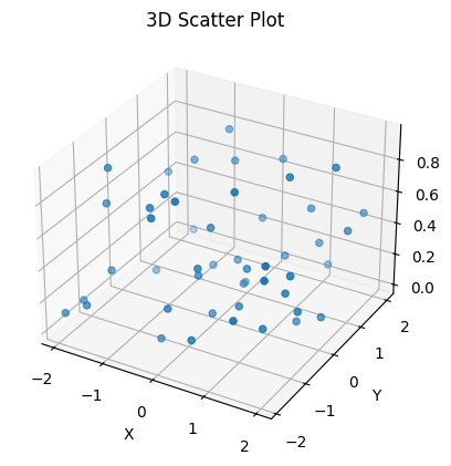
We randomly generated 50 data points and passed the x, y, z arrays to scatter().
A 3D scatter plot is produced with default dots as the markers. We can customize the appearance by changing the marker style, size, color etc.
Scatter plots are useful for visualizing data clusters and relationships in 3D. Let’s look at a more realistic example.
Visualizing EEG Brain Data
Here we will visualize EEG (Electroencephalogram) measurements of brain activity in a 3D scatter plot. The ‘x’ position corresponds to the EEG channel location on the scalp. The ‘y’ values are set to 0, serving as a placeholder, since we are focusing on the distribution over channels (x-axis) and their corresponding signal amplitude (z-axis). The ‘z’ position represents the signal amplitude from the EEG data matrix, specifically, the first measurement from each of the channels.
First, we import the necessary libraries: numpy for numerical operations, matplotlib.pyplot for plotting, and Axes3D from mpl_toolkits.mplot3d for making 3D plots.
import numpy as np
import matplotlib.pyplot as plt
from mpl_toolkits.mplot3d import Axes3D

# Load EEG data
eeg_channels = 32
eeg_samples = 1024
eeg_data = np.random.randn(eeg_channels, eeg_samples)

# Channel positions
chan_pos = np.linspace(-1, 1, eeg_channels)

# Plot
fig = plt.figure()
ax = fig.add_subplot(111, projection='3d')

ax.scatter(chan_pos, np.zeros(eeg_channels), eeg_data[:,0],
            c='b', marker='o')

ax.set_xlabel('Channels')
ax.set_ylabel('')  # add a label for the Y axis if necessary
ax.set_zlabel('Amplitude')
ax.set_title('EEG 3D Scatter Plot')

plt.show()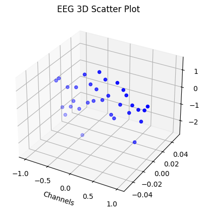
Next, we simulate and load a random sample EEG dataset using numpy’s random.randn function. In this example, we are using a dataset with 32 channels and 1024 samples.
For the channel positions, we generate 32 evenly spaced numbers between -1 and 1 using numpy’s linspace function and save it in chan_pos.
Then, we create a 3D scatter plot with x, y, and z coordinates representing the channels, a placeholder (all zeros), and the first sample of EEG data from each channel respectively. The scatter plot uses blue circles (‘o’) to mark each channel.
The ‘x’ and ‘z’ axes are labelled as ‘Channels’ and ‘Amplitude’, respectively. The scatter plot is titled ‘EEG 3D Scatter Plot’. Since the Y position doesn’t represent any particular variable in our EEG data (it’s a placeholder set to zero), we leave it unlabeled.
By executing plt.show(), we generate and display the plot.
This visualization allows us to see the variation in the first measurement of EEG signal amplitude across different channels on the brain scalp in 3D.
3D Bar Charts
Bar charts are commonly used for visualizing categorical data. 3D bar charts show comparisons across three dimensions, introducing a third visual aspect: depth. The Axes3D.bar3d() method is used to generate 3D bar charts in Matplotlib.
Let’s examine a simple 3D vertical bar chart:
import numpy as np
import matplotlib.pyplot as plt
from mpl_toolkits.mplot3d import Axes3D

fig = plt.figure()
ax = fig.add_subplot(111, projection='3d')

# Map categorical group data to numerical data
x_categories = ['Group 1', 'Group 2', 'Group 3']
x_values = np.arange(len(x_categories))

y = np.zeros_like(x_values)
z = np.zeros_like(x_values)

dx = np.ones_like(x_values)
dy = np.ones_like(x_values)
dz = [2, 3, 5]  # values for each bar

ax.bar3d(x_values, y, z, dx, dy, dz)

ax.set_title('3D Vertical Bar Chart')
ax.set_xlabel('Groups')
ax.set_xticks(x_values)
ax.set_xticklabels(x_categories)
ax.set_ylabel('Y Axis')
ax.set_zlabel('Z Axis Data')

plt.show()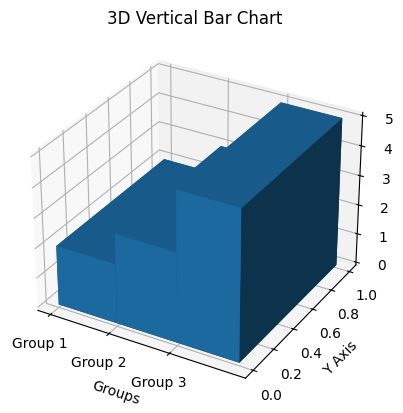
In this code, we passed the numerical representation of our categorical groups, and their corresponding values to the bar3d() method, along with bar width and depth, to plot vertical bars.
For 3D stacked bar charts, where bars representing different groups are stacked over each other, we can utilize a similar method:
import numpy as np
import matplotlib.pyplot as plt
from mpl_toolkits.mplot3d import Axes3D

fig = plt.figure()
ax = fig.add_subplot(111, projection='3d')

# Sample data
x_categories = ['Group A', 'Group B', 'Group C']
x = np.arange(len(x_categories))
y1 = [5, 4, 2]
y2 = [3, 5, 4]
y3 = [2, 1, 3]

y_positions = np.zeros_like(x)

width = 0.5
depth = 0.3

ax.bar3d(x, y_positions, y1, width, depth, y1, color='b')
y_positions += y1  # Object to help stack the bars
ax.bar3d(x, y_positions, y2, width, depth, y2, color='g')
y_positions += y2  # Updating stack
ax.bar3d(x, y_positions, y3, width, depth, y3, color='r')

ax.set_title('3D Stacked Bar Chart')
ax.set_xlabel('Group')
ax.set_xticks(x)
ax.set_xticklabels(x_categories)
ax.set_ylabel('Y Axis')
ax.set_zlabel('Values')

plt.show()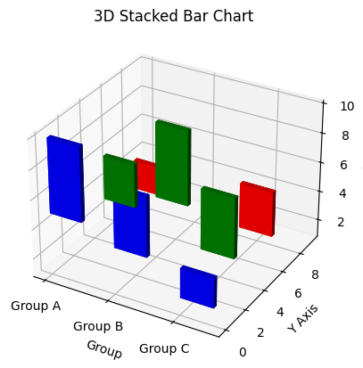
Here, the first group of bars are drawn, then y_positions is updated by adding the first group’s values, allowing the second group to be displayed atop the first. This process repeats, ensuring that each group stacks properly.
Your customization can include bar colors and legends, offering a variety of ways to create various types of visually appealing and informative 3D bar charts.
Other 3D Plot Types
We looked at the most common 3D plot types. Additionally, Matplotlib provides generic 3D line and scatter plotting functions that can be used to create other custom 3D plots:
Axes3D.plot()- Plot lines and markers in 3D spaceAxes3D.scatter()- Scatter points with custom markers in 3D
Some examples of other 3D plots:
- 3D Parametric Curves
- 3D Contour and Colormesh plots
- 3D Vector Fields (Quiver plots)
- 3D histograms
- 3D Ribbon and Box Plots
The basic process involves generating the x, y, z data arrays and passing them to the appropriate Matplotlib plotting method for 3D.
Conclusion
In this guide, we covered the basics of 3D plotting with Matplotlib in Python. The key concepts like 3D projections, coordinate system, and plotting functions were discussed.
We looked at various examples of generating 3D surface, wireframe, scatter, and bar charts along with code samples. Animation of 3D plots was also demonstrated.
Matplotlib provides a feature-rich API for 3D data visualization. Using its wide range of plotting options, you can gain meaningful insights from multi-dimensional data for science, analytics, and visualization applications. 3D plots allow seeing patterns, geometry, and relationships that are not perceivable in 2D.