Hexagonal binning plots, also known as hexbin plots, are a type of two-dimensional histogram that uses hexagonal cells to visualize the density of data points. Unlike standard histograms which use rectangular bins, hexagonal binning offers advantages like reducing sampling bias and visualizing spatial patterns in data.
In this comprehensive guide, we will examine how to create hexagonal binning plots in Python using code examples. We will cover the basics of hexbin plots, walk through implementations in key Python visualization libraries, discuss customization techniques, see real-world use cases, and highlight best practices.
Table of Contents
Open Table of Contents
Overview of Hexagonal Binning Plots
A hexbin plot divides the plot area into hexagonal cells and counts the number of data points that fall within each hexagon. The hexagons are color-coded based on the counts, allowing us to visualize the density distribution of points. Areas with densely packed points are shaded in darker colors while sparsely populated regions appear lighter.
Hexagonal binning plots are useful for revealing clusters, trends, and outliers in large spatial datasets like geospatial data. The hexagonal tiling minimizes quantization artifacts and sampling bias compared to rectangular histograms. Hexbins can also handle very large datasets with millions of points efficiently.
Some key advantages of hexagonal binning plots include:
- Reduces sampling bias and visual distortions compared to rectangular bins
- Effective for spatial data visualization and identifying clusters
- Computationally efficient for large datasets with millions of points
- Flexible grid size and color mapping to highlight patterns
- Simple to interpret density distribution based on color intensity
In Python, we can create hexbin plots using Matplotlib, Seaborn, Plotly, and other libraries. Let’s look at code examples for generating hexagonal binning plots step-by-step.
Hexbin Plots with Matplotlib
Matplotlib’s hexbin() function allows generating hexagonal binned plots easily. We just need to pass in the x and y data to hexbin().
Here is a simple example:
import matplotlib.pyplot as plt
import numpy as np

x = np.random.randn(1000)
y = np.random.randn(1000)

plt.hexbin(x, y, gridsize=30)

plt.colorbar()
plt.show()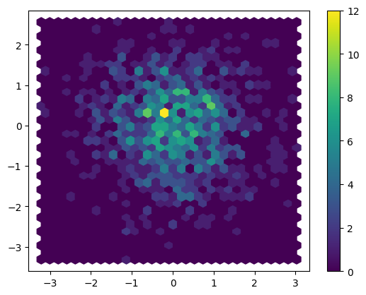
This generates a hexagonal binning plot with 30 hexagons across the plot area and uses a color gradient to indicate density.
We can customize the hexbin plot by adjusting parameters like gridsize, cmap, reduce_C_function, etc.
gridsizecontrols the number of hexagons tiled horizontally across the plot.cmapsets the colormap used to map counts to colors.reduce_C_functionspecifies how to reduce counts within each hexagon for coloring.
For example:
plt.hexbin(x, y, gridsize=40, cmap='viridis', reduce_C_function=np.sum)This uses a viridis colormap and sums counts in each hexagon.
We can also plot the hexbin layer on top of a scatter plot to combine both visualizations:
plt.scatter(x, y, alpha=0.5)

hb = plt.hexbin(x, y, gridsize=30, cmap='Greys')

plt.colorbar(hb)
plt.show()
This overlays a transparency-adjusted scatter plot under the hexbin plot.
Hexbin Plots with Seaborn
Seaborn provides a jointplot() function to easily visualize bivariate data. We can display a hexbin plot using kind='hex' option.
It’s worth noting Seaborn is built on top of Matplotlib, so it uses Matplotlib for rendering the plots.
Here’s an example:
import numpy as np
import seaborn as sns

x, y = np.random.multivariate_normal([0, 0], [[1, 0.5], [0.5, 1]], 1000).T

sns.jointplot(x=x, y=y, kind="hex", color="#4CB391")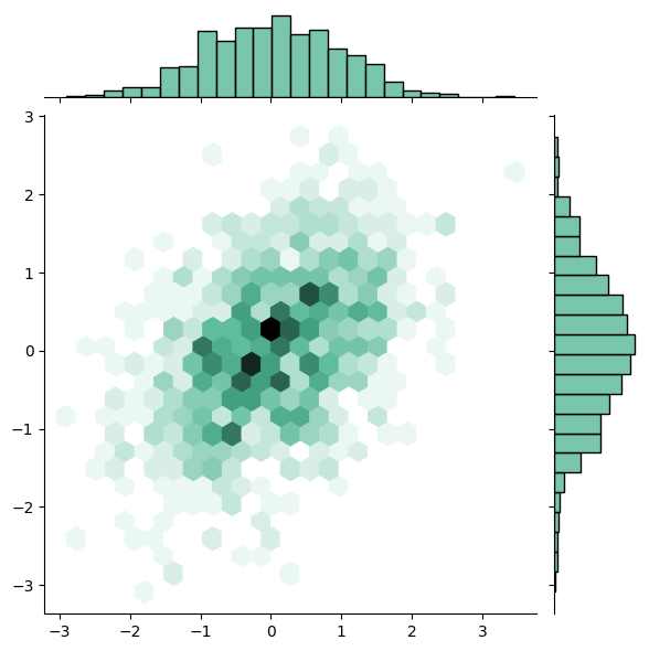
This generates a hexbin joint plot colored using a custom hex color.
We can adjust the gridsize parameter to increase/decrease the hexagon tiling density and cmap to set the color palette used.
Seaborn also offers a pairplot() function to plot pairwise relationships in a dataset. We can visualize hexagonal binning for each pair of columns by passing kind='hex':
iris = sns.load_dataset('iris')

sns.pairplot(iris, kind="hex")
This creates hexbin plots for each pair of feature columns in the Iris dataset.
Hexbin Plots with Plotly
Plotly’s Python graphing library plotly.express offers a density_heatmap() function to generate hexbin plots.
We need to set histfunc to 'sum' to compute counts for hexagonal binning:
import plotly.express as px

df = px.data.iris()

fig = px.density_heatmap(df, x="sepal_width", y="sepal_length",
                         histfunc='sum', nbinsx=30, nbinsy=30)

fig.show()
This plots a 30x30 hexbin heatmap for the Iris dataset.
For use in Jupyter notebooks, we need to call init_notebook_mode() before using Plotly:
import plotly.io as pio
pio.renderers.default = "notebook"
pio.init_notebook_mode()
We can also create interactive plots by passing hover_name and hover_data parameters to show tooltips on hover:
fig = px.density_heatmap(df, x="sepal_width", y="sepal_length",
                         hover_name='species', hover_data=["petal_width", "petal_length"],
                         histfunc='sum', nbinsx=40, nbinsy=40)
This generates an interactive hexbin plot with hover tooltips.
Customizing Hexbin Plots
Here are some key aspects to customize in hexbin plots:
Grid Size
Control density of hexagonal tiling using gridsize or nbins parameters. Higher values mean more, smaller hexagons.
Color Map
Choose a perceptually uniform colormap like viridis, plasma etc. for clearer patterns. Qualitative maps are useful if plotting categorical data.
Color Scale
Use a narrow color range or diverging color map to highlight smaller differences. Log scales can improve visual contrast.
Transparency
Set alpha to layer hexbin on top of scatter plots.
Counts Algorithm
Change metric used to summarize counts within hexagons, like mean, max, sum etc.
Labels and Annotations
Add value labels, titles, legends to highlight insights from the visualization.
Interactivity
Use tooltips, zooming, panning to allow exploring patterns in the data. Plotly enables interactivity like hovering over data points to view additional information.
Examples of Hexbin Plot Usage
Here are some examples demonstrating effective use cases of hexagonal binning plots:
Spatial Point Pattern Analysis
Hexbin plots excell at revealing clusters, gaps, and outliers in spatial data like GPS coordinates, earthquake epicenters, disease outbreaks etc. The hexagonal tessellation handles sampling bias better.
For example:
import matplotlib.pyplot as plt
import numpy as np

# Generate random spatial points
num_points = 1000
rand = np.random.RandomState(42)
lat = rand.uniform(20, 50, num_points)
lng = rand.uniform(-120, -80, num_points)

# Plot spatial points
fig, ax = plt.subplots()
ax.scatter(lng, lat, alpha=0.5)

# Add hexbin layer
hb = ax.hexbin(lng, lat, gridsize=12, cmap='viridis')
fig.colorbar(hb)

# Customize plot
ax.set_title("Spatial Point Pattern")
ax.set_xlabel("Longitude")
ax.set_ylabel("Latitude")
ax.set_xlim(-125, -75)
ax.set_ylim(15, 55)

# Annotate interesting region
upper_cluster = ax.scatter([-115], [35], c='r', s=200)
ax.annotate("Upper Cluster", (-115, 35), xytext=(-130, 30), arrowprops=dict(facecolor='black'))

fig.tight_layout()
plt.show()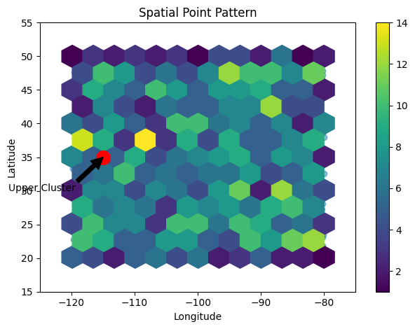
This generates 1000 random (lng, lat) points to simulate spatial data, then creates a hexbin plot to analyze the point patterns.
We customize the plot by setting limits, labels, title, and annotating an interesting clustered region. The hexagonal grid reveals the density distribution and clusters in the spatial data.
This demonstrates how hexbin plots can be used effectively for spatial point pattern analysis on geographic data. The code can be extended further to work with real spatial datasets.
Visualizing Multidimensional Data
For high dimensional data, hexbin plots can visualize pairwise relationships between dimensions and identify clusters. The density color mapping highlights patterns.
import seaborn as sns

# Load iris dataset
iris = sns.load_dataset('iris')

# Hexbin plot for two dimensions
sns.jointplot(data=iris, x="sepal_length", y="sepal_width", kind='hex')

# Pairwise hexbin plots
sns.pairplot(iris, kind="hex", hue="species")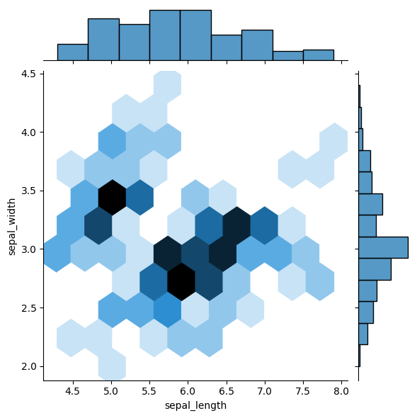
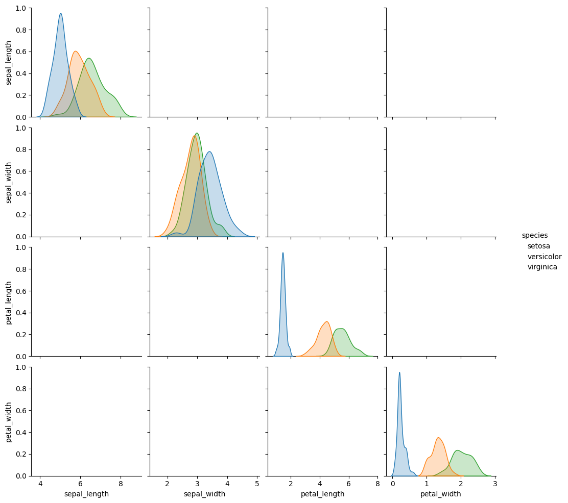
This uses Seaborn to generate hexbin plots to visualize relationships between the multidimensional iris dataset features. The pairwise plots highlight clusters in the data.
Large Dataset Visualization
Hexbins are computationally efficient for visualizing millions of data points compared to scatter plots. The grid reduction aggregates points into hexagon cells.
import numpy as np
import matplotlib.pyplot as plt

# Generate large random dataset
x = np.random.randn(1000000)
y = np.random.randn(1000000)

# Hexbin plot
plt.hexbin(x, y, gridsize=50, cmap='viridis')
plt.colorbar()

plt.title("Large Dataset Hexbin")
plt.xlabel("X")
plt.ylabel("Y")
plt.show()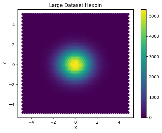
Identifying Distribution Shapes
Hexbin plots can reveal the underlying shape and skewness of complex distributions better than histograms with rectangular bins.
from scipy.stats import norm, logistic
import matplotlib.pyplot as plt
import numpy as np

# Generate distributions
x1 = np.linspace(-5, 5, 200)
x2 = np.linspace(-5, 5, 200)
y1 = norm.pdf(x1, 0, 1)
y2 = logistic.pdf(x2, 0, 1)

# Hexbin plot
plt.hexbin(x1, y1, gridsize=30, cmap='Blues')
plt.hexbin(x2, y2, gridsize=30, cmap='Reds', alpha=0.5)

plt.legend(['Gaussian', 'Logistic'])
plt.title("Distribution Shapes")
plt.show()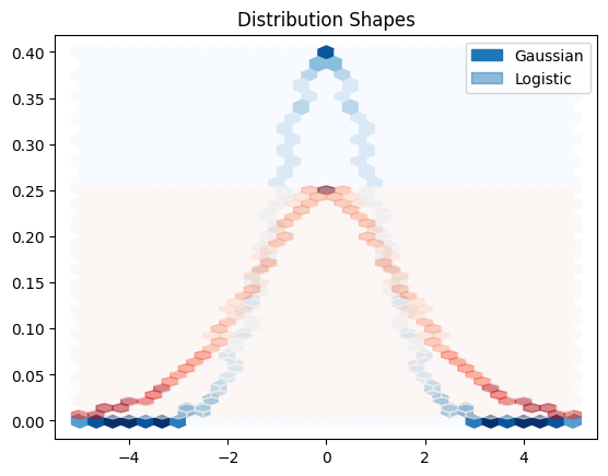
Overlaid hexbin plots reveal the different shapes of Gaussian and Logistic distributions.
Time Series Analysis
For time series data, hexbin plots with time on the x-axis and another variable on the y-axis can visualize temporal patterns efficiently.
import pandas as pd
import matplotlib.pyplot as plt
import matplotlib.dates as mdates
import numpy as np

# Create dummy time series data
date_rng = pd.date_range(start='2023-01-01', end='2023-12-31', freq='D')
value = np.random.rand(len(date_rng))

data = pd.DataFrame({'date': date_rng, 'value': value})

# Sort the data by date
data.sort_values(by='date', inplace=True)

# Convert dates to numerical values using date2num
data['num_date'] = data['date'].apply(mdates.date2num)

# Create a figure and axis
fig, ax = plt.subplots()

# Hexbin plot of time vs value using num_date
hb = ax.hexbin(data['num_date'], data['value'], gridsize=20, cmap='magma')

# Add a colorbar
cb = plt.colorbar(hb)

# Set the x-axis as dates and rotate the labels for readability
ax.xaxis.set_major_formatter(mdates.DateFormatter('%Y-%m-%d'))
plt.xticks(rotation=45)

plt.xlabel('Time')
plt.ylabel('Value')
plt.title("Time Series Hexbin")
plt.tight_layout()  # Adjust the layout to prevent label clipping
plt.show()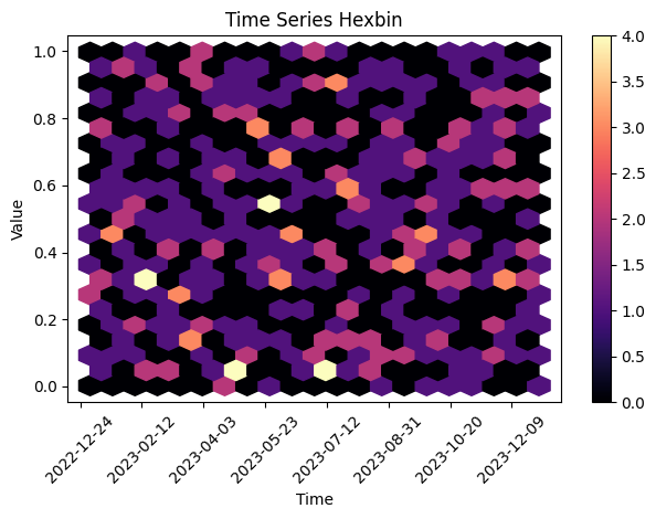
The code generates a hexbin plot illustrating the relationship between time (x-axis) and random values (y-axis) for a time series dataset, with rotated x-axis labels for improved readability.
Interactive Hexbin Plots with Bokeh
Bokeh provides interactive hexbin plots that allow panning, zooming, and tooltips.
We can create Bokeh hexbin charts using the HexTile renderer:
from bokeh.plotting import figure, show
from bokeh.models import HoverTool
import numpy as np

# Generate random data points for demonstration
x = np.random.randn(1000)
y = np.random.randn(1000)

# Create a Bokeh figure
plot = figure(tooltips=[("Count", "@c")])

# Create hexagonal bins and specify the size and line color
plot.hex_tile(x, y, size=0.5, line_color=None)

# Add a hover tool for tooltips
hover = HoverTool(tooltips=[("Count", "@c")])
plot.add_tools(hover)

# Show the plot
show(plot)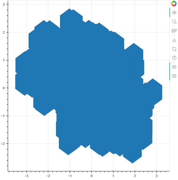
This generates an interactive hex tile plot with value tooltips.
We can also set orientation to 'pointytop' or 'flattop' to adjust hexagon orientation.
Bokeh lets us hook callbacks to react to selections and hover events to create dynamic visualizations. This makes it a great choice for building interactive dashboards with hexbin plots.
Best Practices for Hexbin Plots
Here are some tips for creating effective hexagonal binning plots in Python:
- Choose appropriate grid density - too high loses patterns, too low obscures details
- Use colorbrewer qualitative/sequential colormaps
- Set transparency to layer hexbin on scatter plots
- Log transform counts for improved visual contrast
- Use hover tooltips in interactive plots
- Add labels, titles and legends to highlight patterns
- Try different count reduction algorithms like mean, max, sum to optimize visualization
- Compare hexbin plots to histograms to assess trade-offs
- Preprocess data to handle outliers and reduce noise
Conclusion
Hexagonal binning is a powerful visualization technique for exploring spatial patterns, clusters, and density distribution in data. Python provides many options through Matplotlib, Seaborn, Plotly, and Bokeh to create customizable hexbin plots.
By tuning parameters like grid size, color mapping, count reduction, and interactivity features, we can generate compelling hexbin visualizations and glean insights from complex multidimensional datasets. Hexbin plots offer advantages over histograms and scatter plots in many use cases and are an invaluable tool for data exploration.